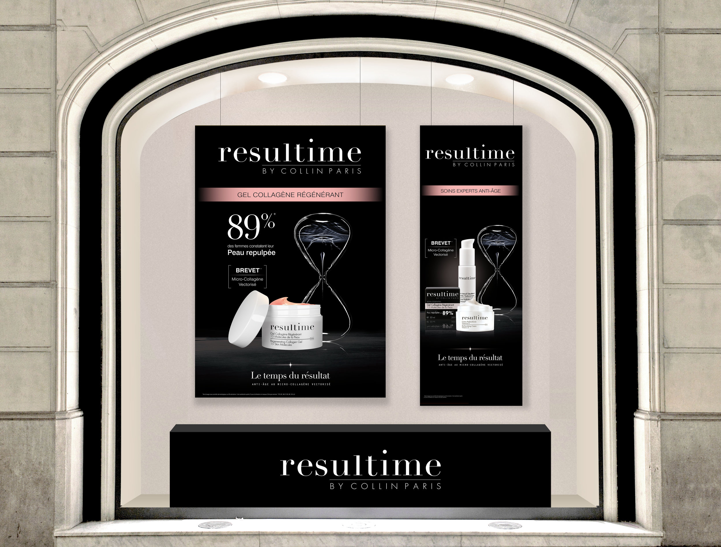

_brief
Resultime being the premium anti-ageing brand of the Nuxe Group, it needed an evolution in its image for more modern look. It positions its self as cosmeceutical brand, and an alternative to aesthetic surgery. The changed needed to happen in the brand’s logo, packaging, editorial design, outdoor advertising and in the point of sales.
_The response
The approach for this deep subject was a little different than usual. Using the early methods of design thinking and placing the consumer at the centre of the design strategy. Women wanted more radiance, and a high-end brand with technical responses to their anti-ageing issues. It became obvious that the use of contrasting fonts, such as serif style and a scientific kind of type associated with an elegant black synonym of maturity and premium look, evolving to a luminous beige radiancing and feminizing the brand were going to be the start of a response to our brief.
_roles
Creative Direction: Ysabelle Meullemiestre.
Art Direction, execution: Deborah Brakha.
_packaging


_editorial design


_point of sale


work with me.


